The Best Movie Posters of 2007
By Bert Ehrmann
December 7, 2007
I love movie posters. Though I might not buy as many posters as I used to (mostly because I can download relatively hi-res copies of posters online) I none-the-less enjoy the art form enough to take the time to catalog the best posters of the year.
(Click on any of the posters for a larger view.)
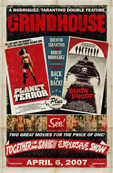
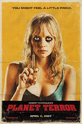
The best movie poster of 2007 was actually the whole campaign of posters for the movie Grindhouse. These Grindhouse posters perfectly hearken back to a simpler time when low-budget movie studios produced very few posters to promote their films. Back then, posters were folded and placed along with reels of film that were shipped cross-country for months, if not years, as the films the posters promoted played in one theater after theater. With each successive stop, the posters would become more and more warped and worn until they were literally falling apart and only being held together by tape.
 |
 |
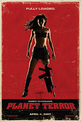 |
Which is why the posters to Grindhouse so perfectly match the movie. Everything about Grindhouse looks like it was created spur of the moment on an extremely limited budget, from an overworked director hacking together spools of film trying to meet a deadline to the posters looking like they were put together by two guys running a design shop/printing press in the basement of a low-rent district someplace in Los Angeles. (Even if, in reality, it cost a reported $53 million to make everything look that old.)
The rest of the best, in alphabetical order:
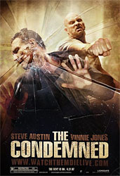 The Condemned: I hate to admit it, but I never actually saw the movie The Condemned. From the trailers/commercials I saw, The Condemned looked like a low-rent Battle Royale, something that I would expect to see on HBO starring Jean-Claude Van Damme or Dolph Lundgren at two o’clock one Sunday morning.
Yet I have to say that the creativity of the poster to The Condemned is quite impressive. When this poster is displayed behind plastic as how movie theaters display their posters, it actually appears as if the action of the poster is about to break out from the poster and spill onto the movie theater floor. Still, even this cool poster wasn’t enough to make me see the movie.
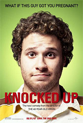 Knocked Up: From the moment I saw Seth Rogan’s mug plastered across the poster for the movie Knocked Up, I knew I had to see this movie. It’s the antithesis of just about every other Hollywood movie poster that features good-looking stars in desirable locals Photoshop-ped to the extreme. In this poster, Rogan, an everyman at best, is presented simply on a green background with copy above “What if this guy got you pregnant?”
I’ve got the feeling that years from now this poster will adorn the walls of college dorm rooms alongside posters for John Belushi in Animal House and posters of scantily clad bikini girls.
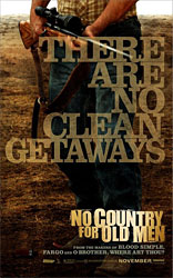
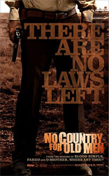
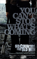
No Country for Old Men: Any poster that features the tagline for the movie in a larger font size than the title of the movie is a winner in my book, but that’s not all there is to love with the poster campaign for No Country for Old Men. Everything from the warm and cool tones of the photos to the old style font used screams “Western,” except that No Country for Old Men is set in the 1980s, makes these posters a winner. Bonus points for those who noticed that the heroes of the movie are presented in warm tones while the villain in cool.
 |
 |
 |
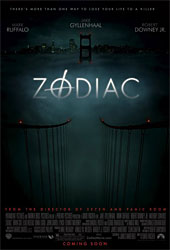 Zodiac: I think what draws me to the teaser poster for Zodiac is the sense of mystery the poster conjures up. From how the bridge cables disappear off into the fog to the way the tower rises up menacingly in the distance with the warning lights appearing like two eyes brought an absolute sense of dread to me from the first time I saw the poster. Most daring of all about this poster is that neither this teaser poster nor final poster released later in the year features any photos of the main cast, a rarity these days where practically every cast member is plastered across movie posters.